CASE STUDY
Overview
Soulsy Wellness is a Reiki and nervous-system-regulation practice designed to support emotional steadiness and grounded presence in an increasingly overstimulated world. The brand required a visual identity that could communicate trust, calm, and credibility without relying on common wellness tropes or overly decorative aesthetics.
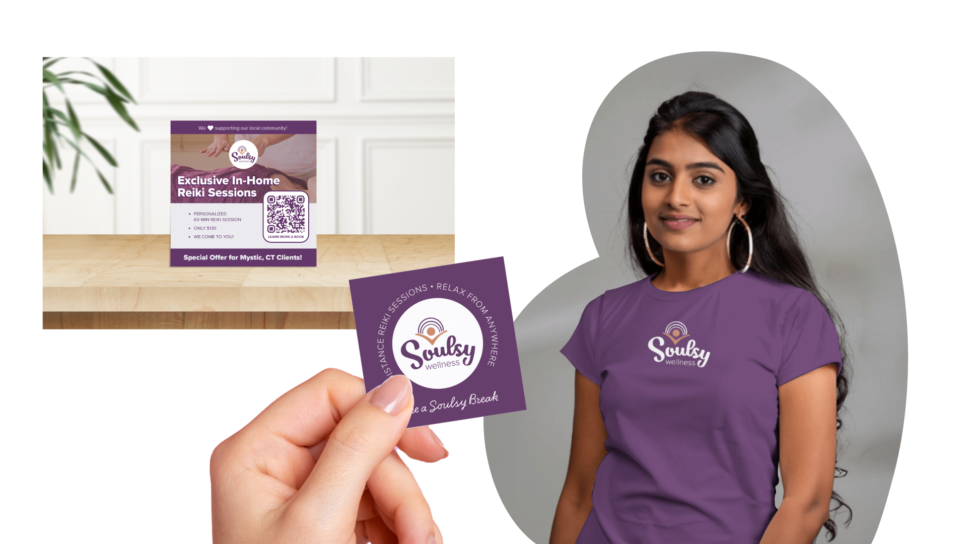
I was asked to develop a cohesive brand identity system that would translate the work's experience into a clear, professional visual language. The system needed to scale across digital and print touchpoints while maintaining integrity over time.
Role: Brand strategy and visual identity design
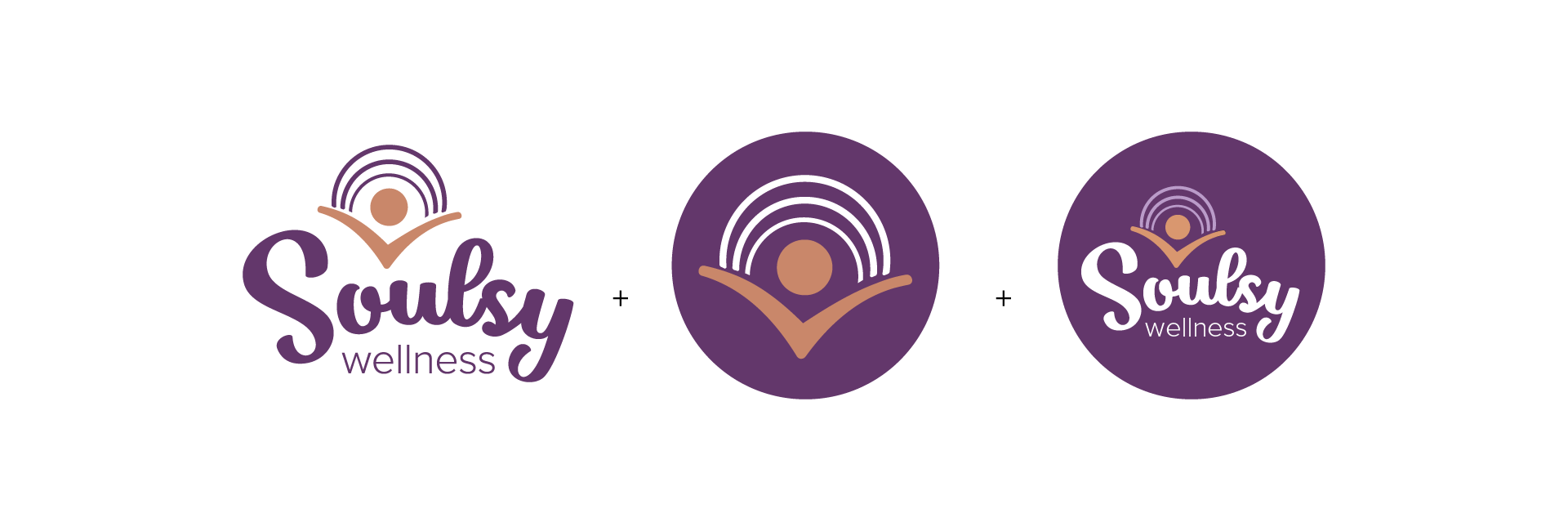
Deliverables: Logo system, color palette, visual brand framework
Deliverables: Logo system, color palette, visual brand framework

Challenge
• The brand needed to communicate calm and trust without appearing generic or trend-driven
• Visual decisions needed to support ease and clarity, not sensory overload
• The identity had to function as a system, not a single expression
• The brand needed to feel emotionally resonant while remaining professionally grounded

Strategy
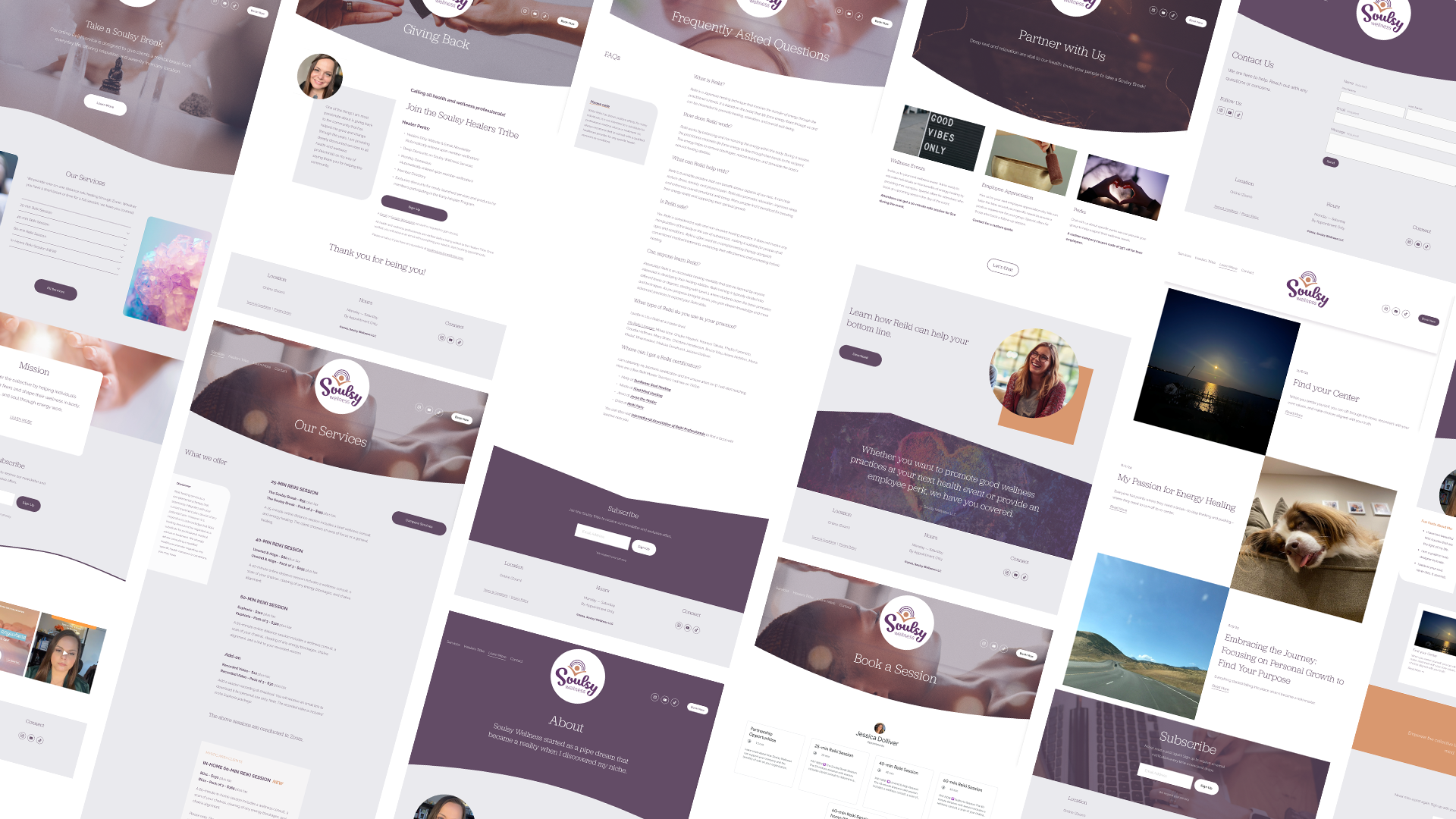
Rather than focusing on surface aesthetics, the strategy centered on how the brand should feel when interacting with. The goal was to create a visual system that supported steadiness, confidence, and continuity, allowing the work itself to remain central without visual distraction.
The identity was approached as a long-term system designed to remain consistent across touchpoints while offering enough flexibility to grow with the practice.
Design Choices
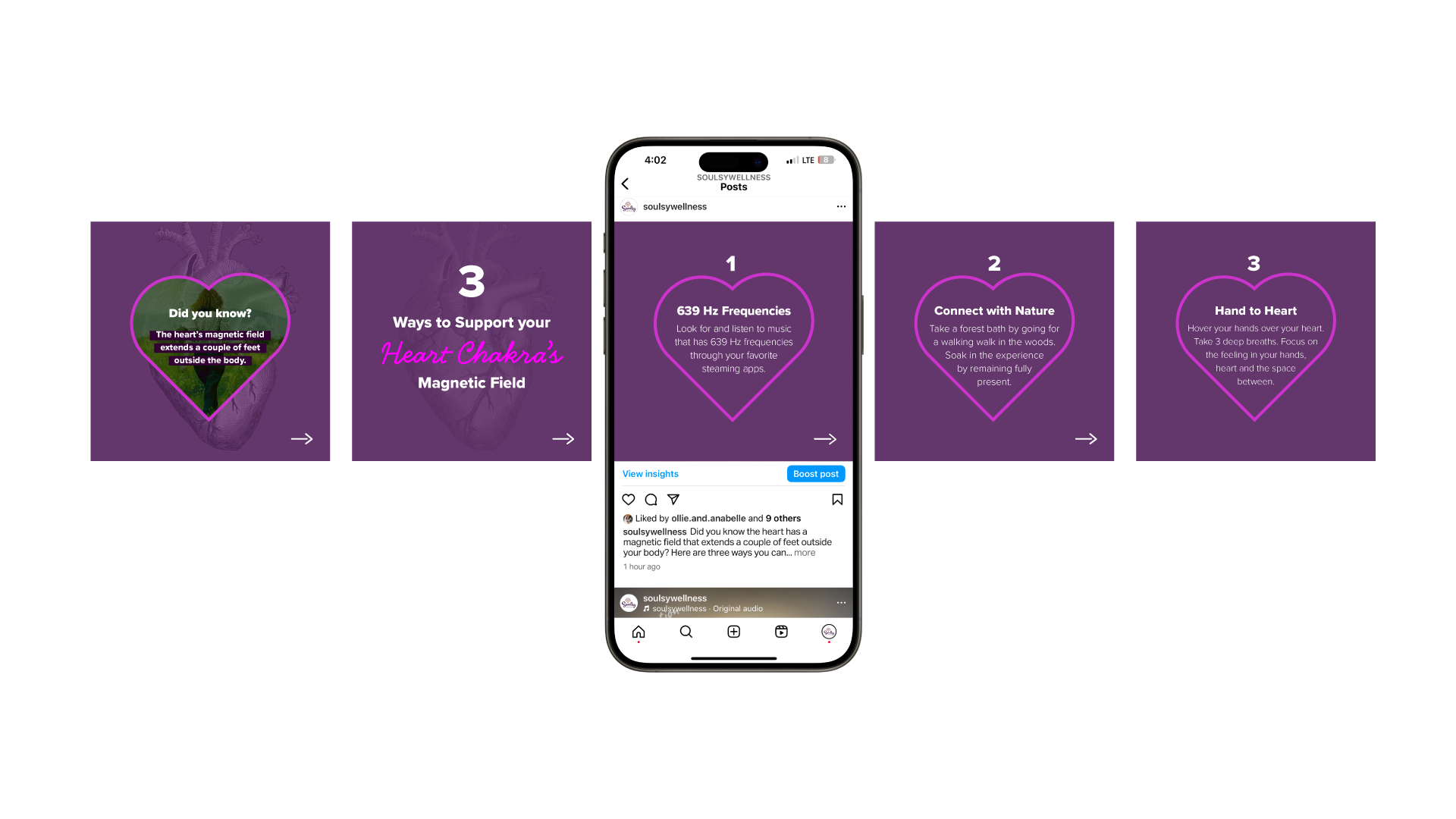
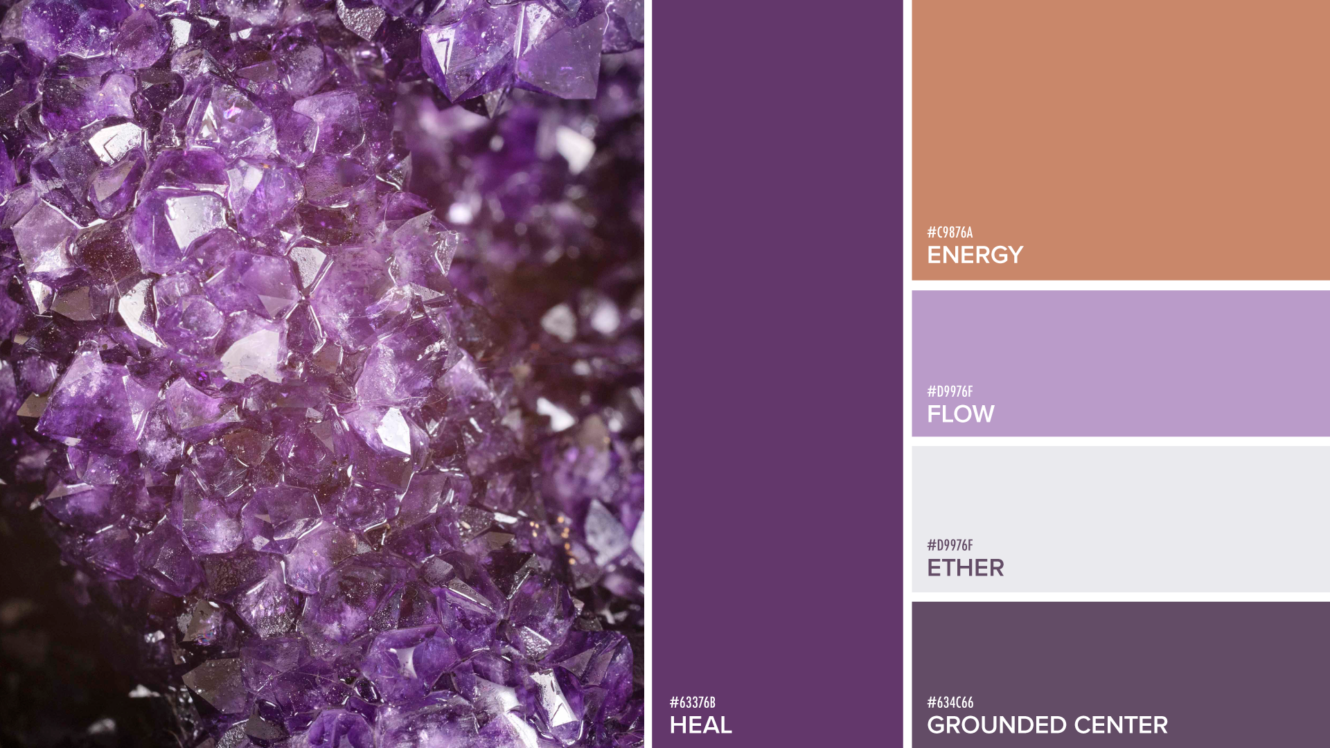
The core palette of purple and white was selected to establish Soulsy Wellness as a composed, credible presence within the wellness market. These tones signal discernment, clarity, and intention, supporting a brand position that feels purposeful and differentiated rather than trend-driven or decorative.
Orange accents were introduced as a strategic counterbalance to add warmth and forward momentum at key interaction points. Used selectively, the accent color supports visual hierarchy and attention flow while preserving the brand’s overall sense of stability.
Together, the palette functions as a strategic system that balances calm authority with measured energy. This allows the brand to communicate trust, focus, and confidence consistently across platforms while remaining adaptable as the business scales.
Visual System Approach
The visual system was crafted around the principles of presence and flow, shaping how the brand is experienced rather than simply how it appears. Presence informed decisions around clarity, spacing, and focus, ensuring the brand communicates steadiness, intention, and confidence at every point of interaction.
Flow guided the relationship between elements, influencing rhythm, alignment, and transitions throughout the system. Together, these principles support a brand experience that feels cohesive, intuitive, and supportive. Interactions unfold naturally while maintaining structure, reinforcing trust and ease while ensuring the system remains flexible and scalable as the brand evolves.
Outcome
The final identity provides Soulsy Wellness with a clear, reliable visual foundation that supports consistency, trust, and long-term growth. The system enables the brand to appear confident across platforms while remaining aligned with its core values and adaptable to future offerings.